In Conversation x Ray Chu
Interview by Rebecca Jones
Rebecca Jones: What inspired this season’s design for RAY CHU, and how does the Crinum asiaticum flower play a central role in the collection?
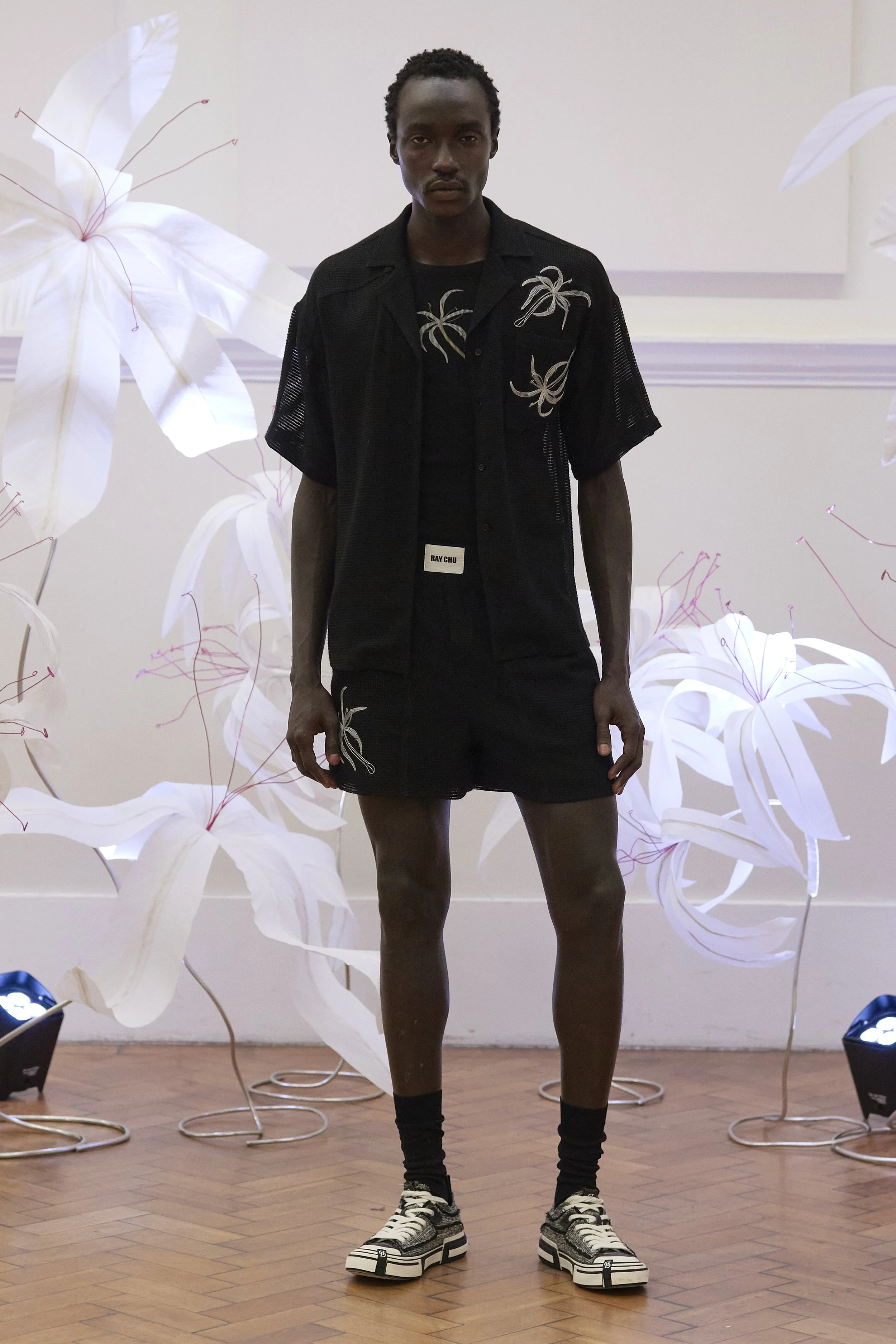
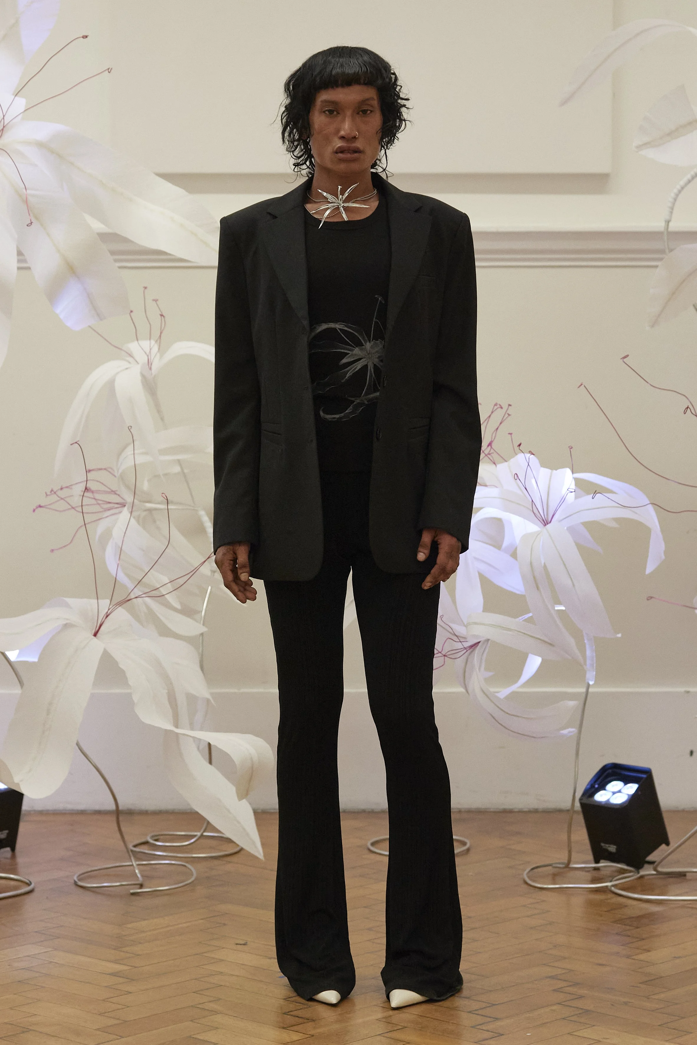
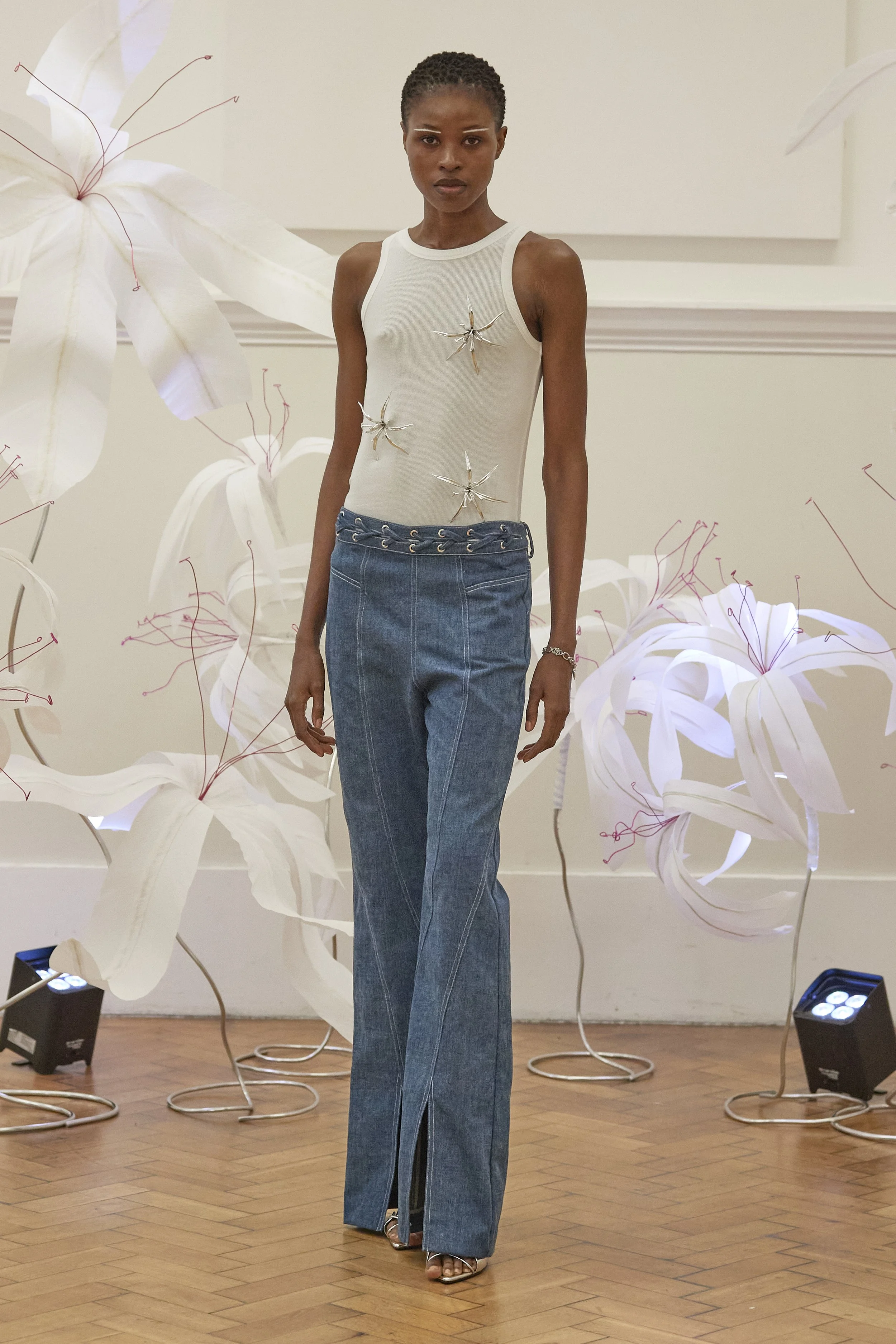
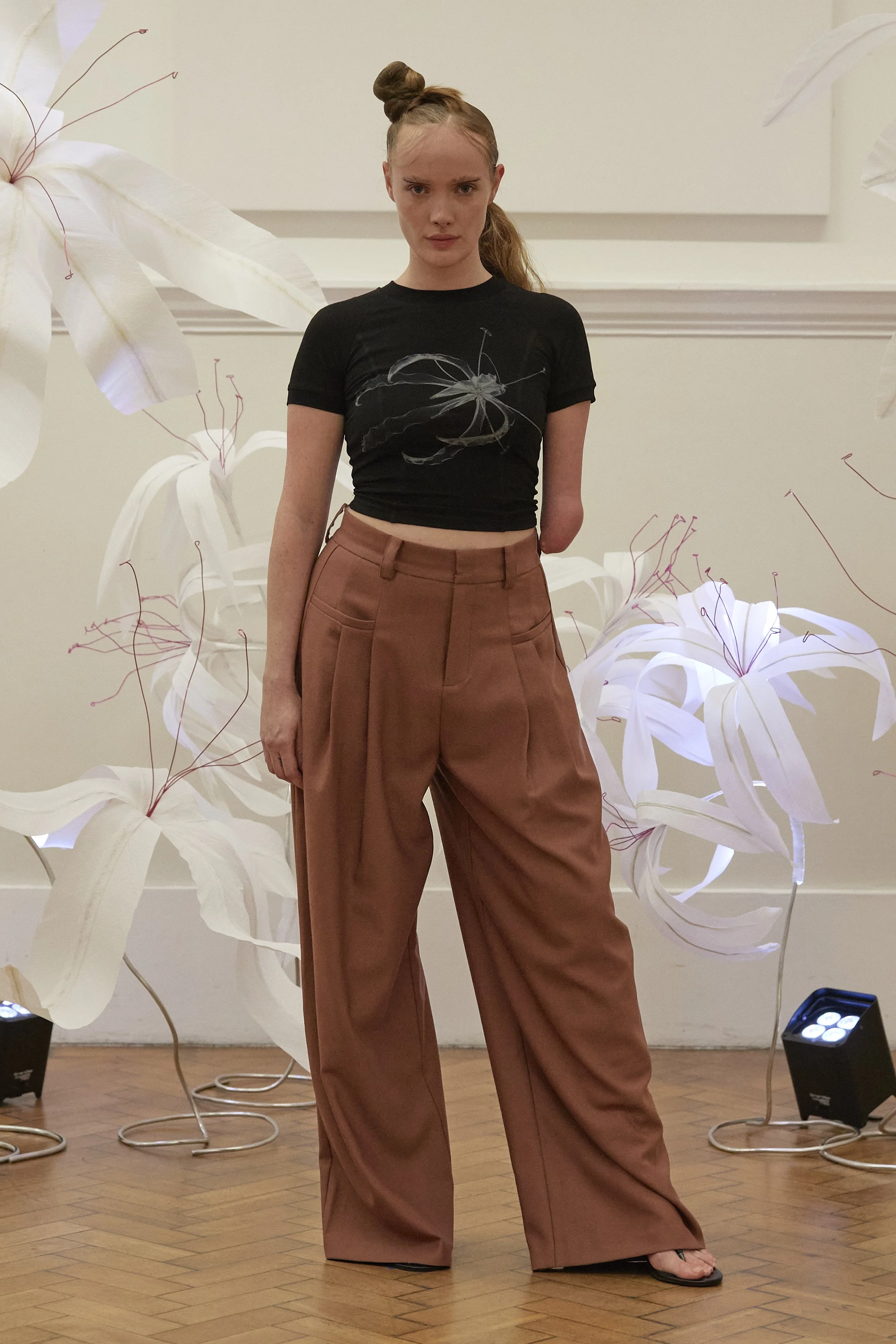
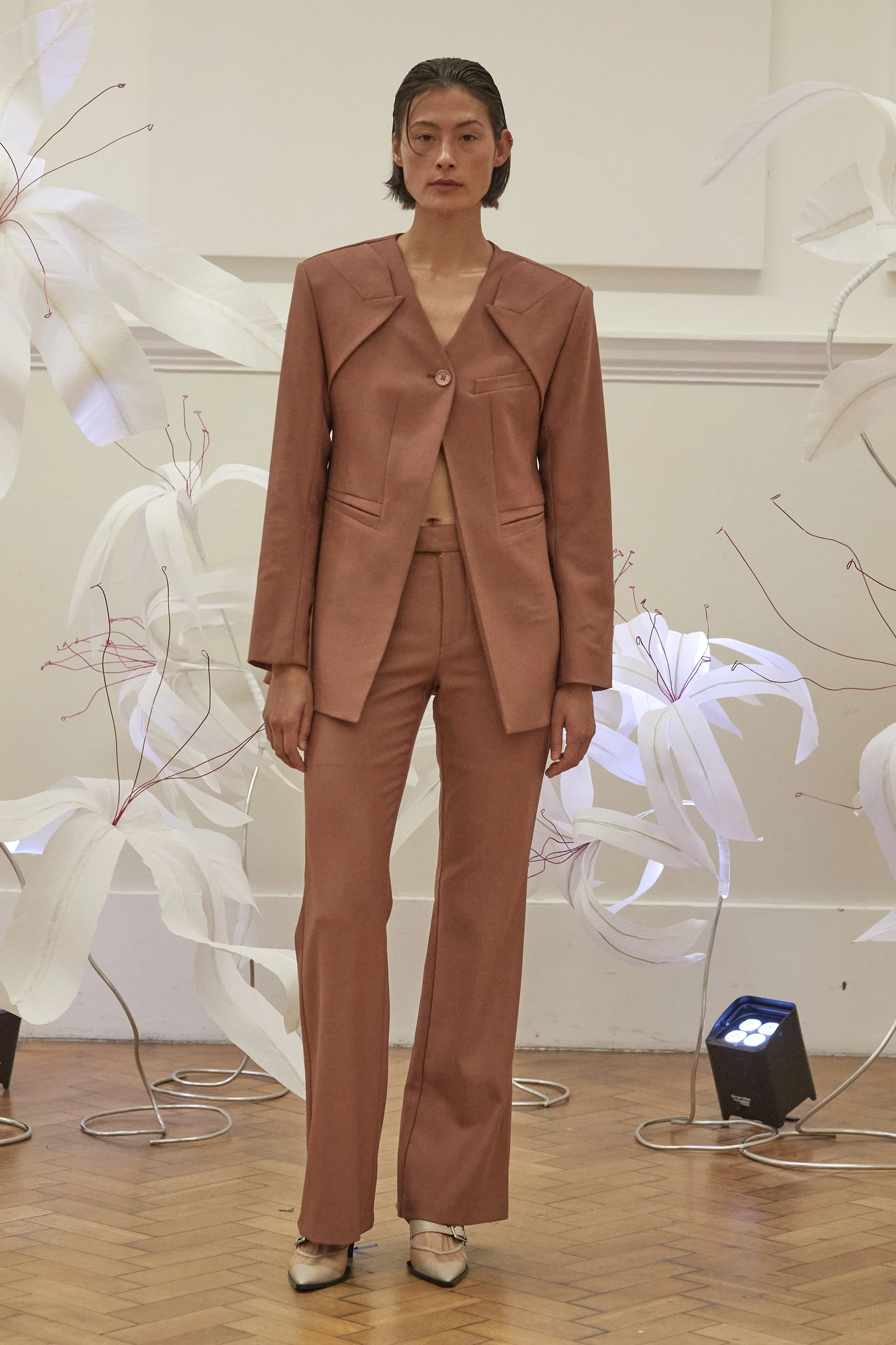
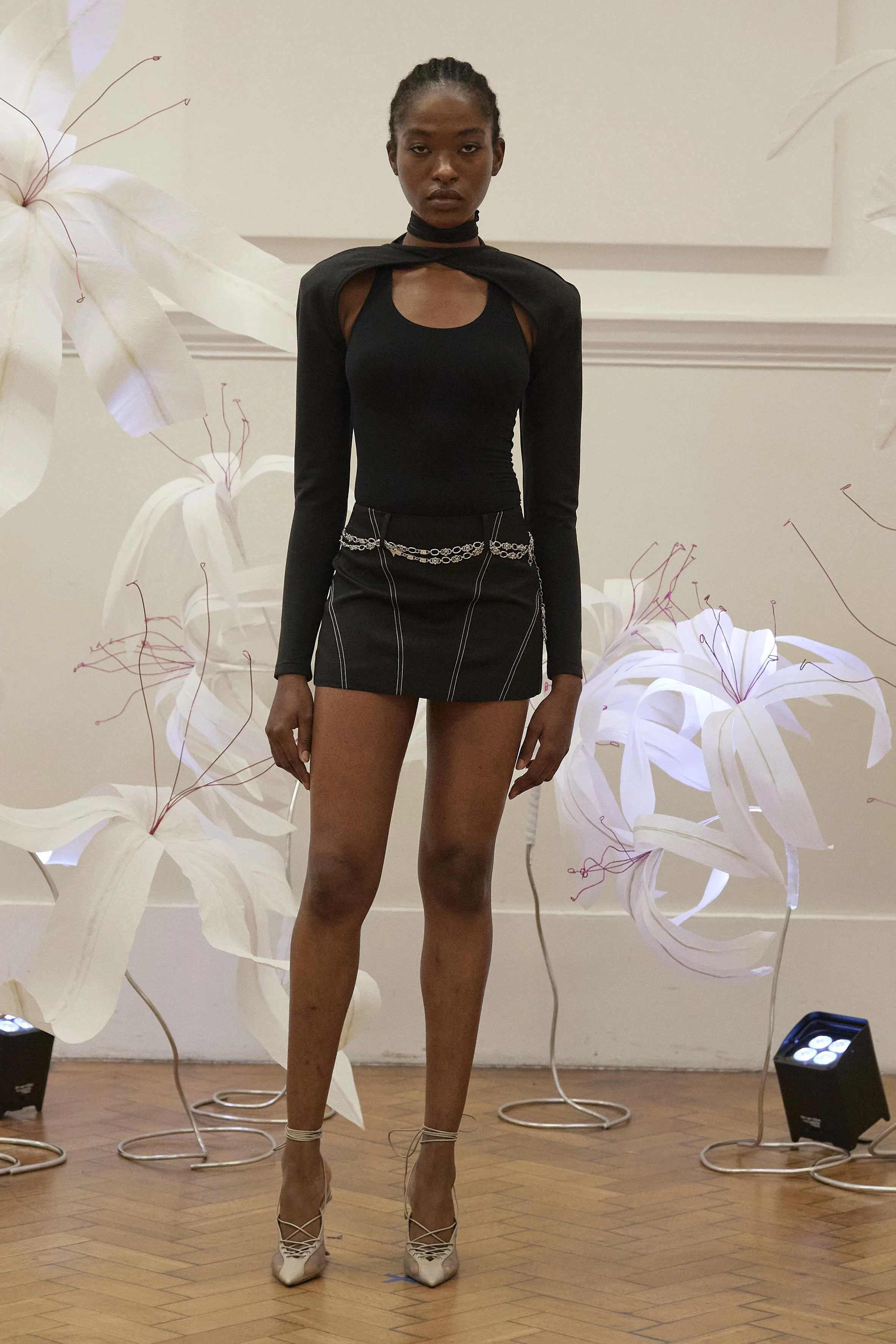
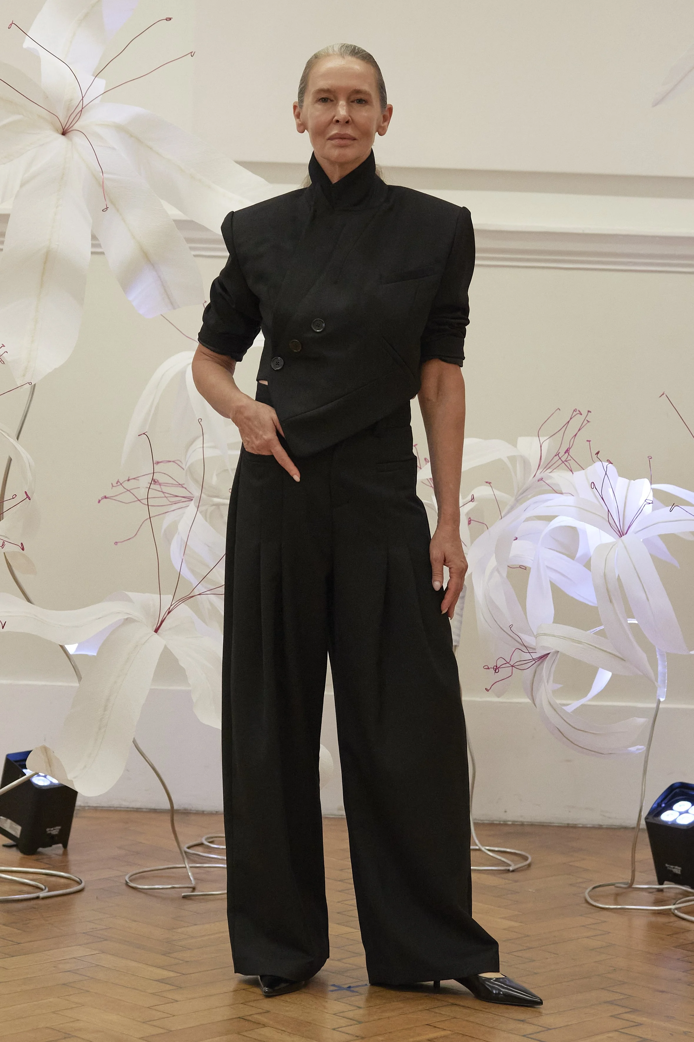
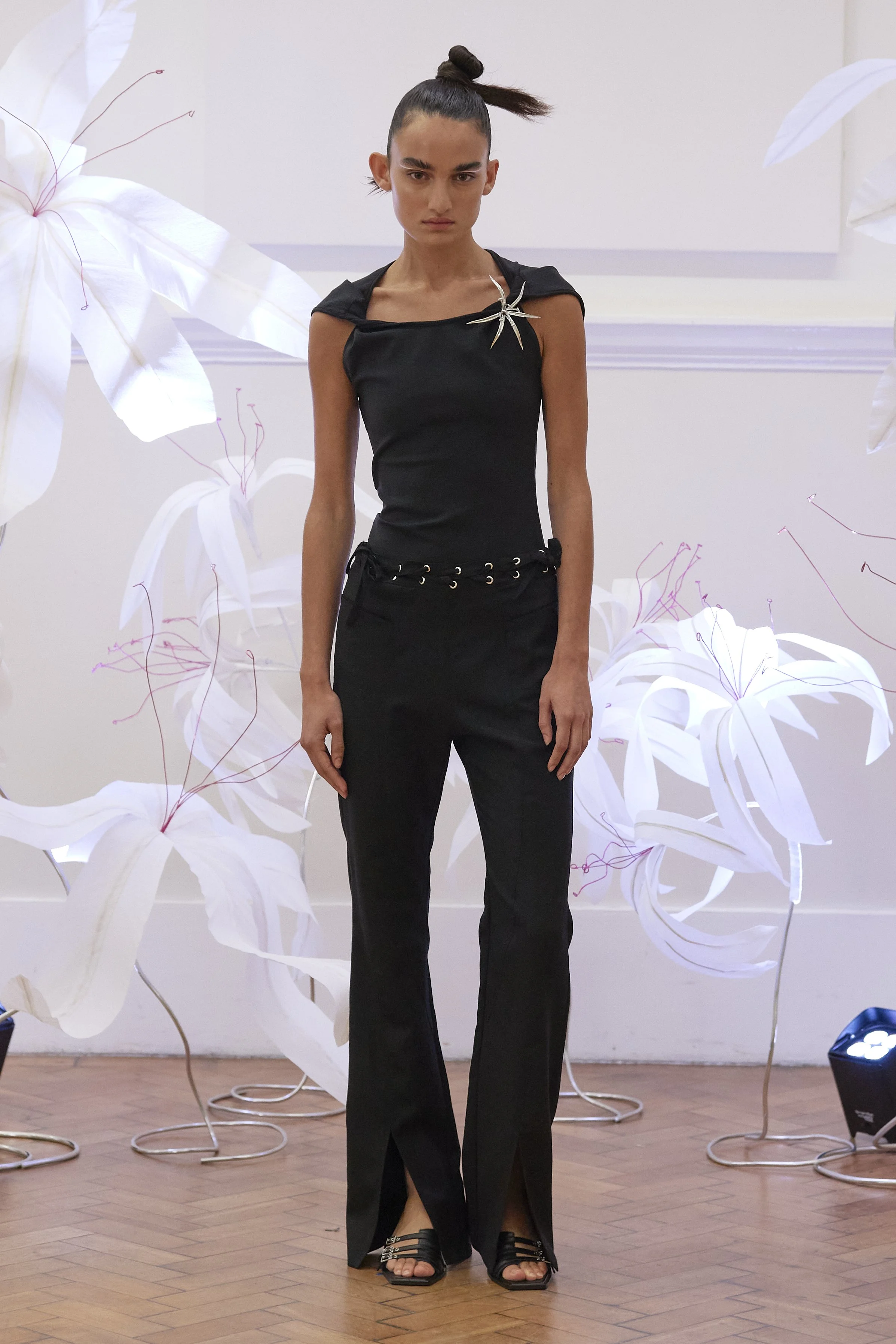
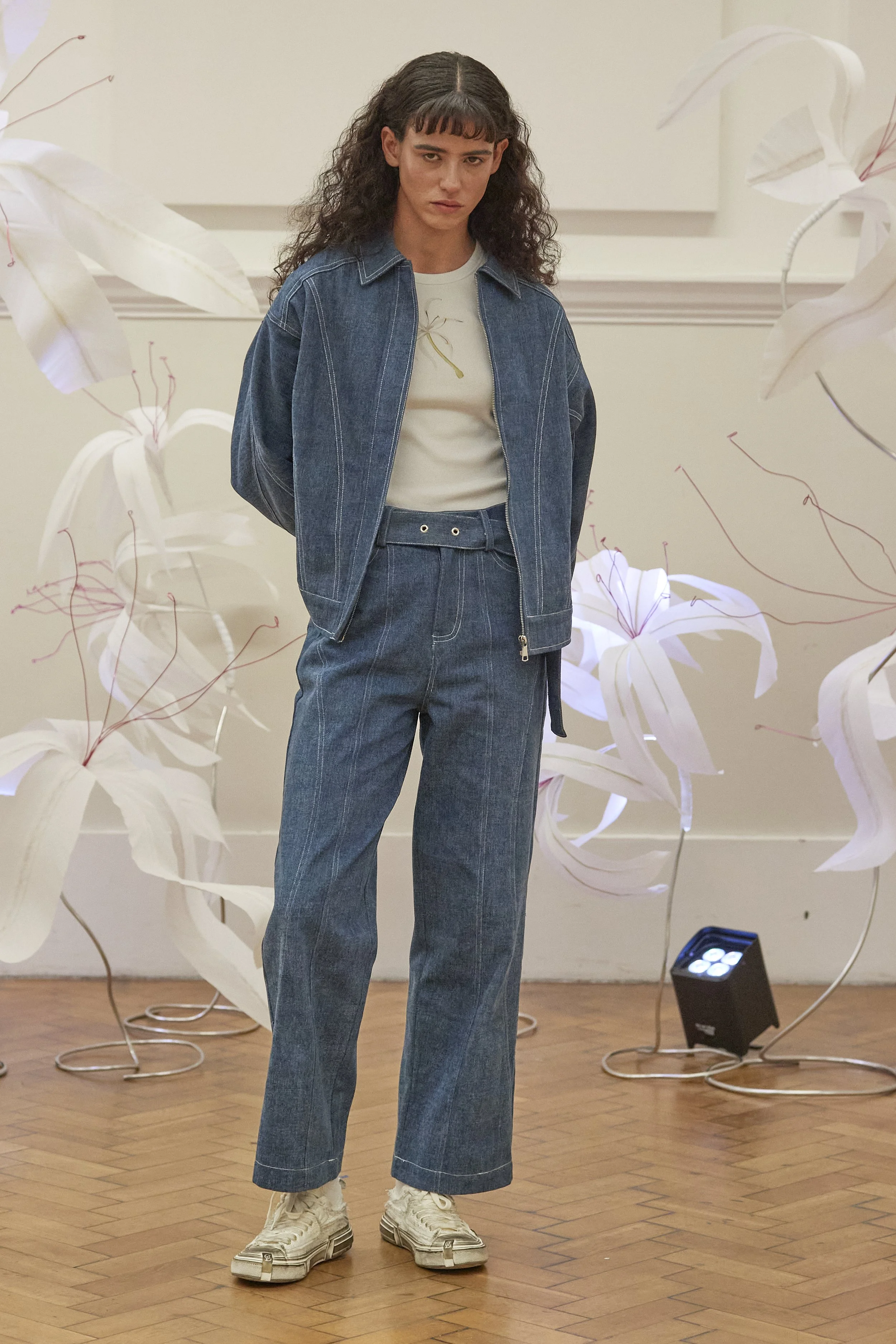
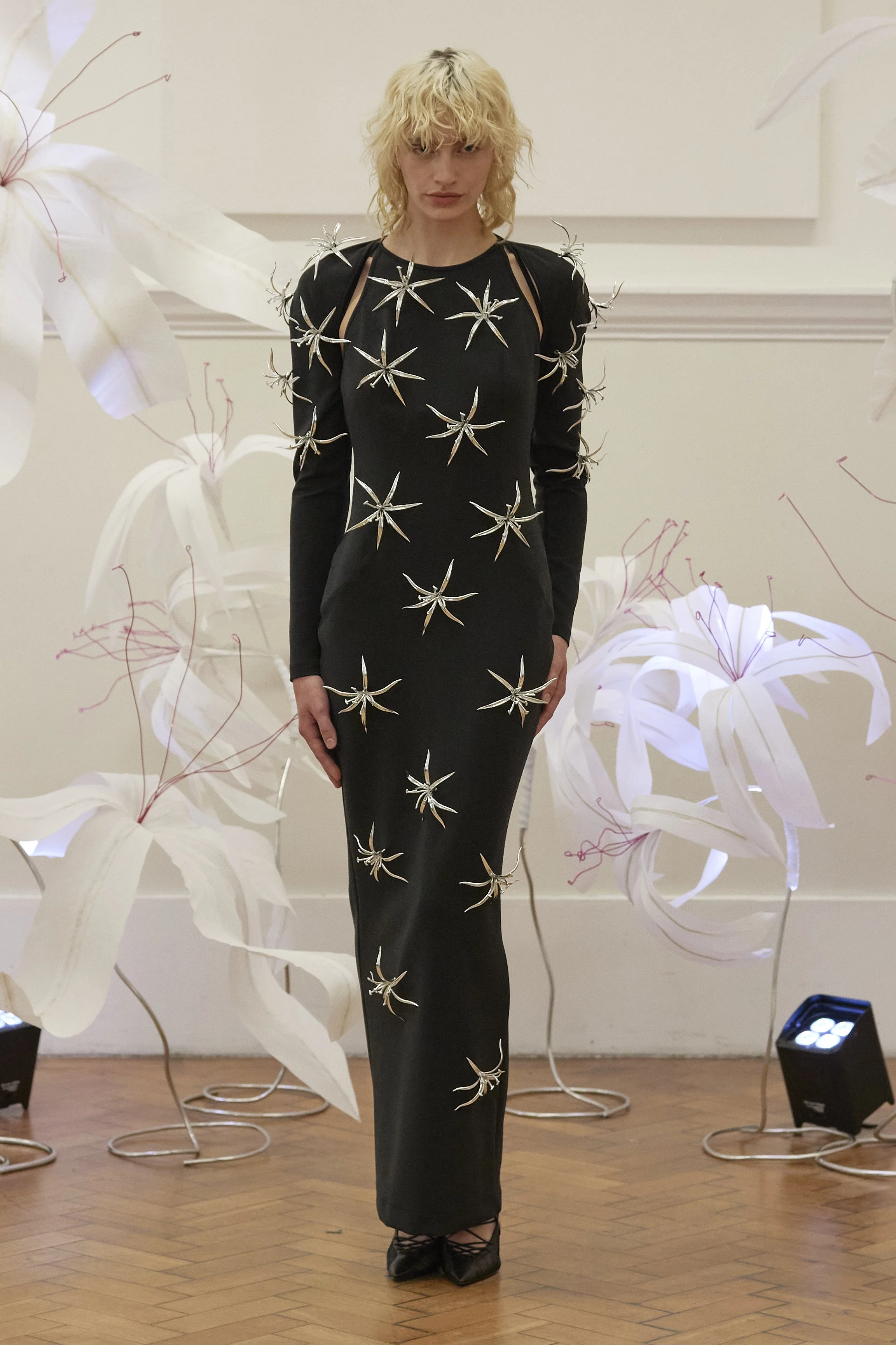
Ray Chu: This season’s design was inspired by the resilience and beauty of drift plants, particularly the Crinum asiaticum flower, which thrives along shorelines. The flower represents wisdom, nobility, and vitality, and it serves as a central motif throughout the collection, reflecting the Taiwanese people’s spirit of resilience and grace. Its distinctive shape and symbolism are incorporated into the 3D-printed elements, graphic printing and the cut in suits.
R.J: Can you tell us more about the significance of the Crinum asiaticum flower in Taiwanese culture and its connection to the Amis tribe?
R.C: The Crinum asiaticum holds deep cultural significance in Taiwan, particularly among indigenous communities like the Amis tribe. The place name “Makung” is derived from the Amis pronunciation of the flower. Beyond its linguistic roots, the flower has long been celebrated for its medicinal properties, such as promoting blood circulation and disinfection. This cultural reverence for the flower underscores its symbolic presence in the collection, weaving tradition and heritage into modern fashion design.
R.J: How did the designer’s personal experience of discovering the Crinum asiaticum during a summer jog lead to the concept for the SS25 collection?
R.C: The designer first encountered the Crinum asiaticum during a summer jog in a park, and this moment sparked a deeper exploration of the plant’s unique characteristics and symbolism. This personal experience translated into a concept for the SS25 collection, where the flower’s qualities of strength and elegance became central to the designs. The flower’s ability to thrive in difficult environments resonated with the designer’s vision of creating garments that embody both resilience and beauty. Also, RAY CHU brand is strong and resilient to tough fashion world.
R.J: In what ways does the flower’s symbolism of wisdom, nobility, and vitality align with RAY CHU’s brand ethos?
R.C: The Crinum asiaticum’s symbolism of wisdom, nobility, and vitality mirrors RAY CHU’s brand ethos of strength, sophistication, and innovation. The brand continuously seeks to balance elegance with boldness, and this flower represents those same ideals. Just as the flower symbolizes regeneration and adaptability, RAY CHU emphasizes sustainability and forward-thinking design, encouraging wearers to embrace new life and possibility.
R.J: How does RAY CHU incorporate 3D printing technology into this season’s designs, and what role do recycled materials play in the collection?
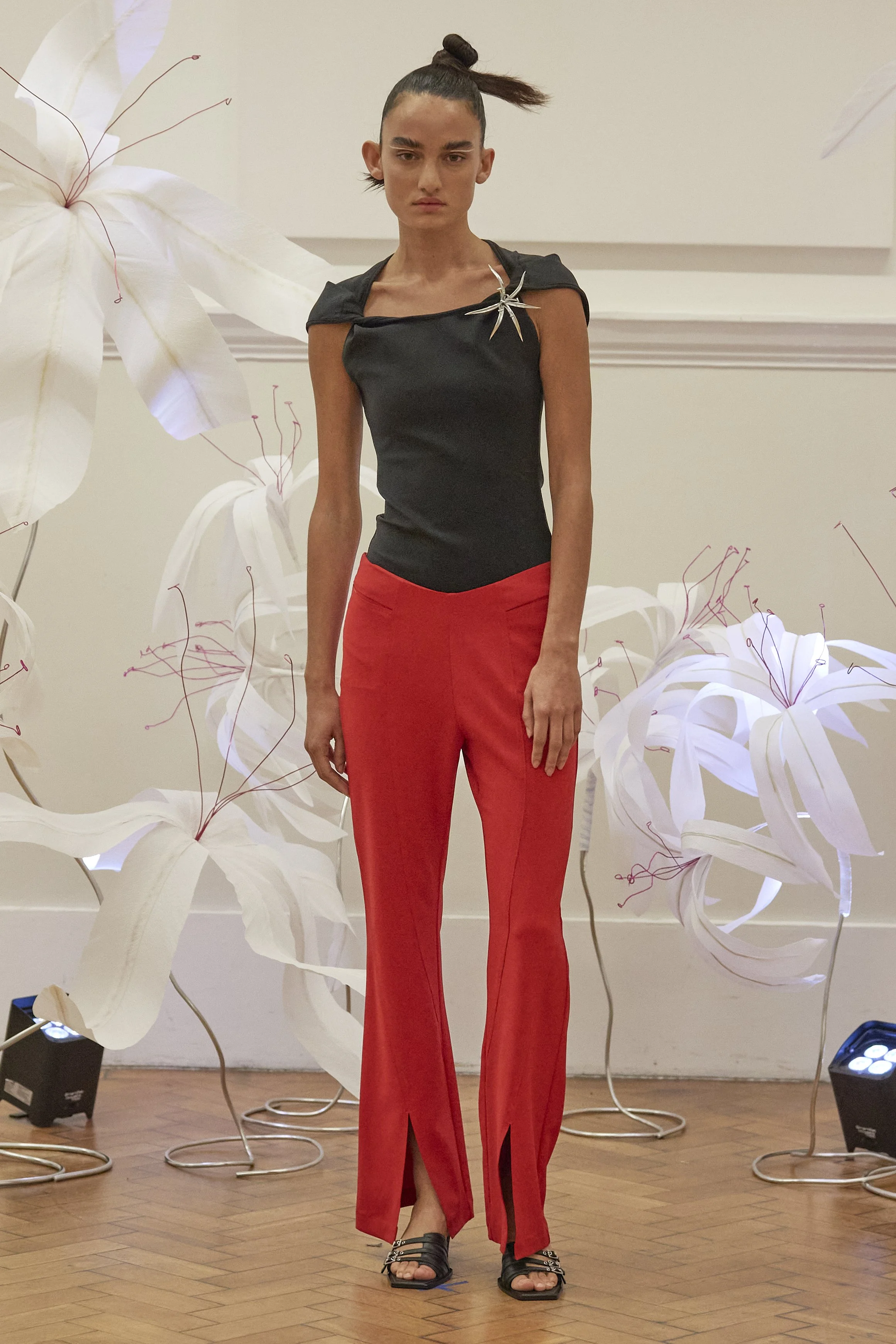
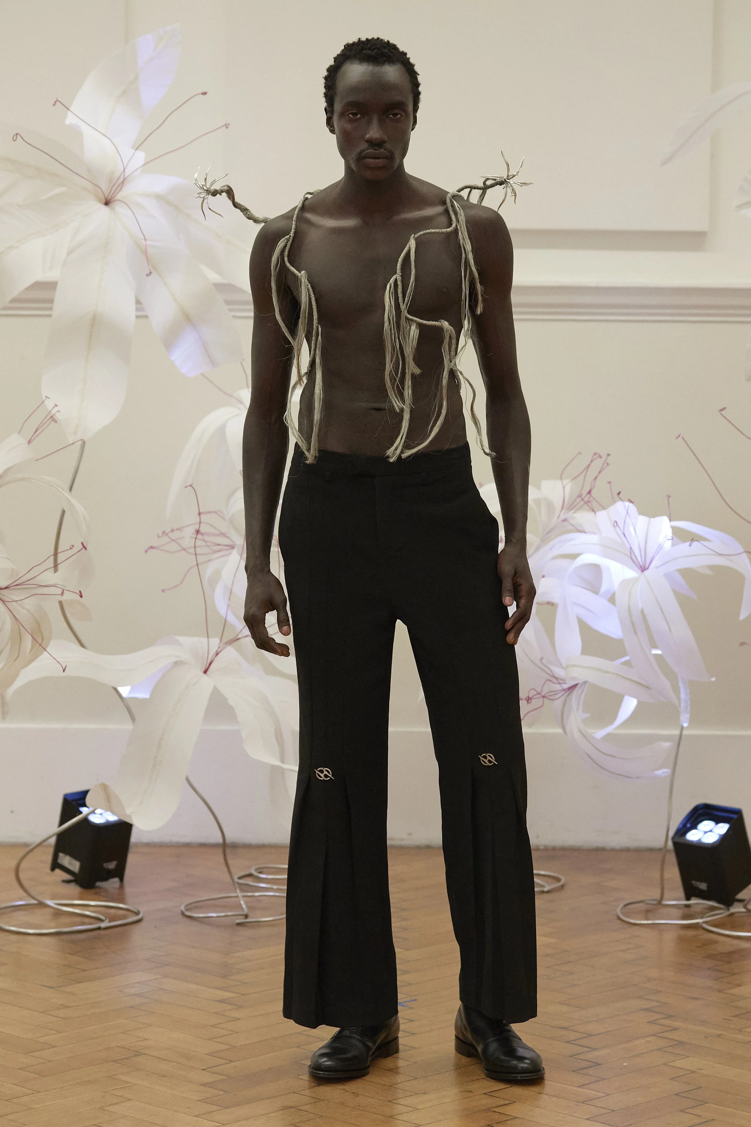
R.C: RAY CHU uses 3D printing technology to bring the Crinum asiaticum flower to life in the collection, adding depth and dimensionality to the garments. The 3D-printed flowers capture the intricate shape and bulbous quality of the plant, seamlessly blending nature with innovation. Additionally, recycled materials such as discarded wires and recycled fish scale textiles play a major role, reinforcing the collection’s theme of reconstruction and renewal by giving new purpose to materials that were once seen as waste.
R.J: Could you explain the design process behind using discarded wires and how they symbolize new life and vitality within the collection?
R.C: In this collection, discarded wires are stripped down, dismantled, and reassembled, symbolizing the process of deconstruction and regeneration. Each layer of wire represents the transformation of waste into something vibrant and alive, echoing the life force of the Crinum asiaticum. This design process embodies the idea of giving new life to what was previously discarded, reinforcing the themes of sustainability and vitality in the collection.
R.J: What can you tell us about the colour palette for the SS25 collection, particularly the use of RAY CHU’s signature fiery red alongside other tones?
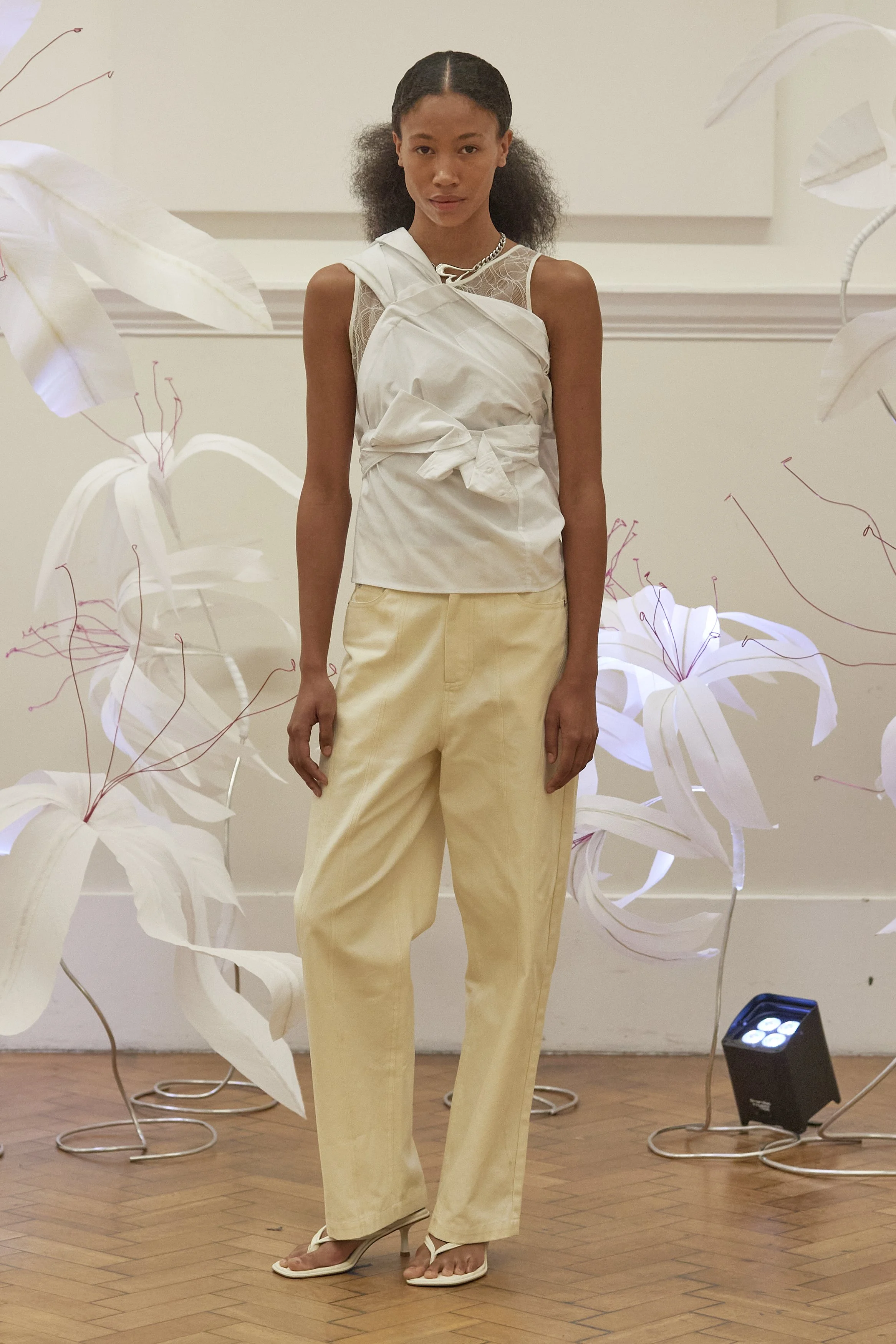
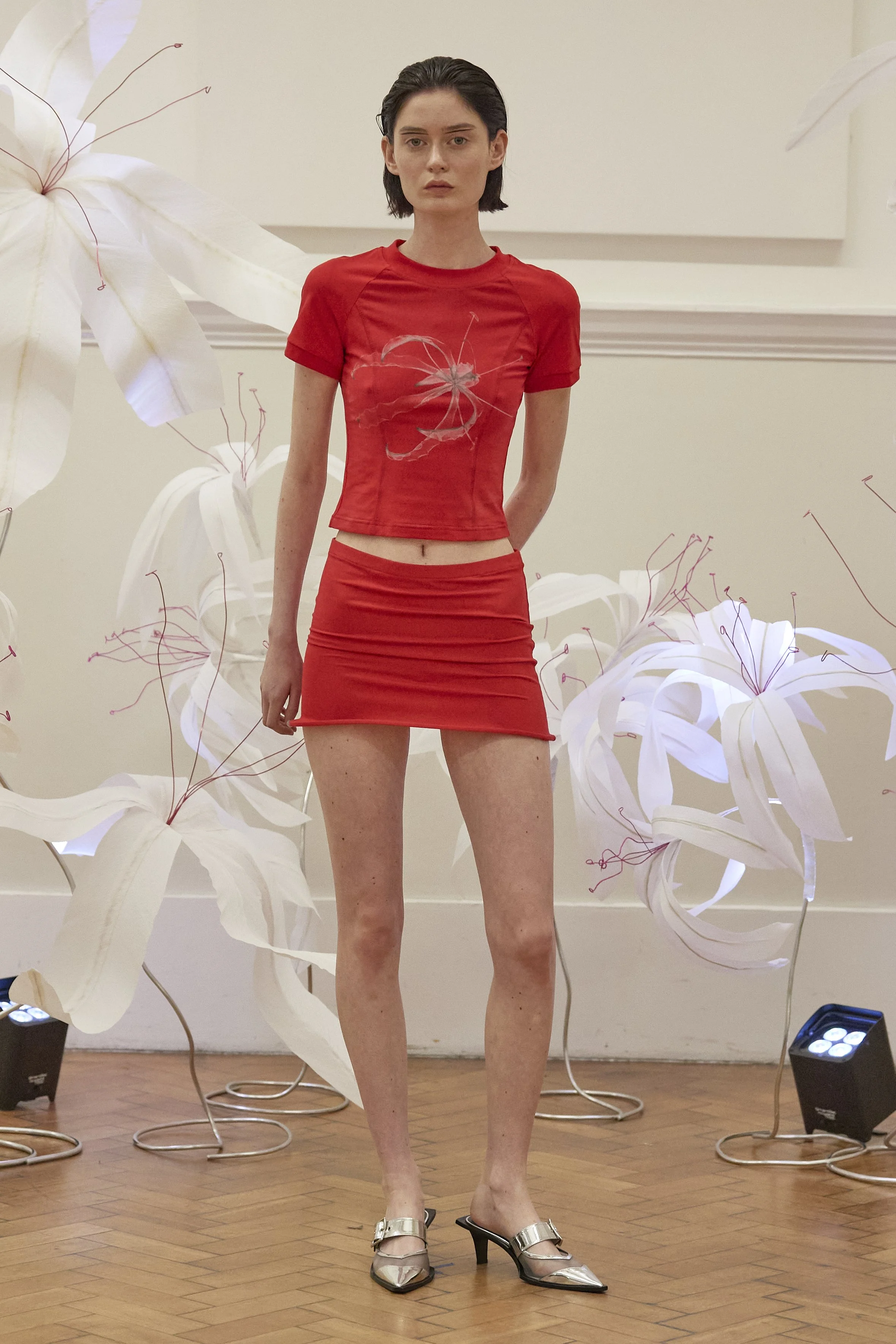
R.C: The SS25 collection’s color palette revolves around RAY CHU’s signature fiery red, a vibrant and bold hue that represents passion and strength. This is balanced by more subdued tones like icy yellow, classic black and white, and other easy-to-wear neutral shades. The palette offers a blend of statement colors and practical options, allowing the collection to remain accessible while making a striking visual impact.
R.J: How do elements like misaligned blazer lapels and flowerpot-inspired dress silhouettes reflect the brand’s balance between practicality and playful design?
R.C: Details like misaligned blazer lapels and flowerpot-inspired dress silhouettes highlight RAY CHU’s ability to blend practicality with whimsy. The tailored touches, such as the misaligned lapels, add an element of surprise and individuality to otherwise classic garments. Meanwhile, the flowerpot-inspired dresses bring a playful and tender vibe to the collection, offering a sense of joy and creativity without sacrificing wearability.
R.J: What makes the fabric choices in this collection unique, especially with the inclusion of recycled fish scale textiles and water chestnut yarns?
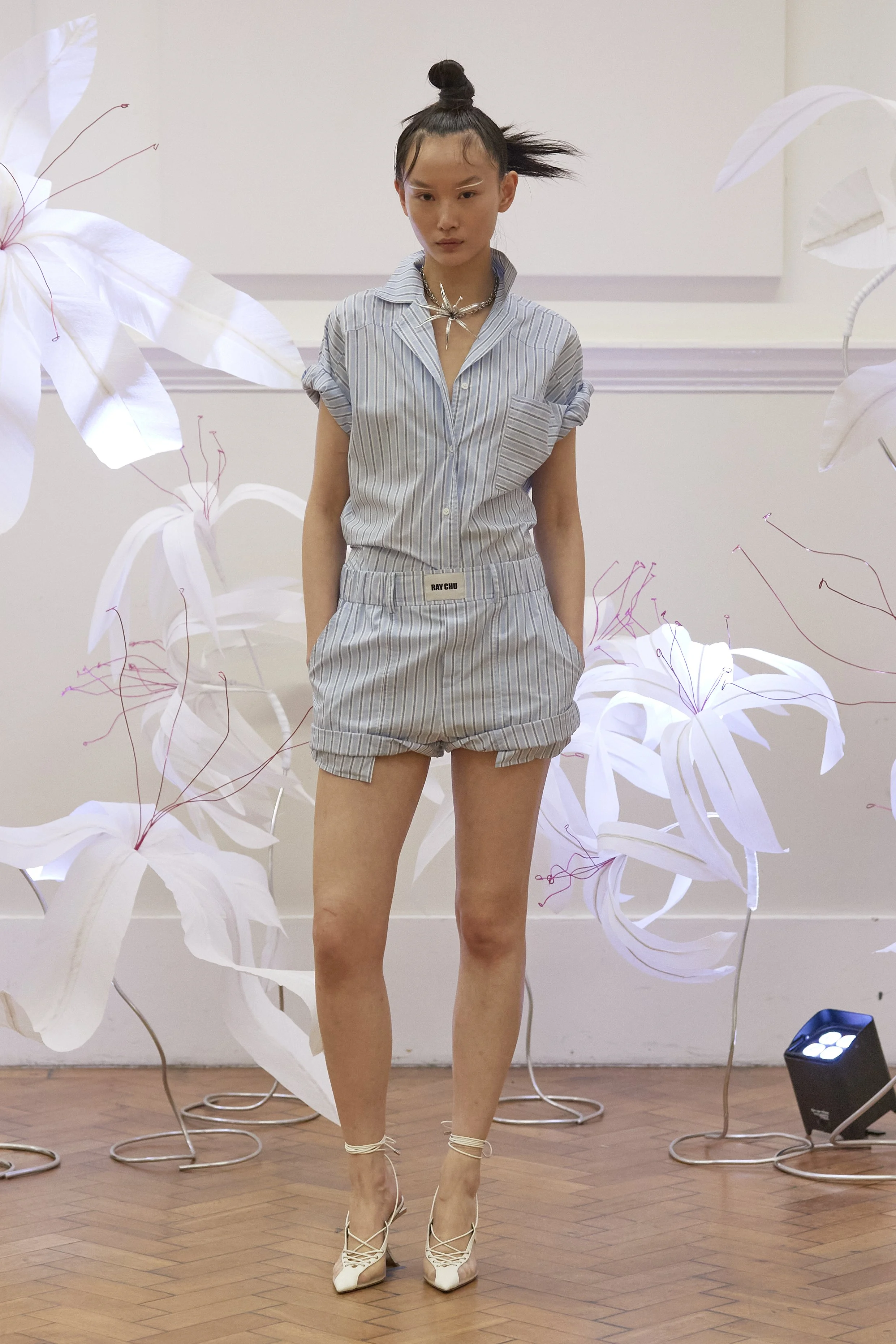
R.C: The fabric choices for SS25 reflect a strong commitment to sustainability and innovation. The use of recycled fish scale textiles and water chestnut yarns speaks to the brand’s dedication to exploring eco-friendly materials. These textiles not only have a unique texture and appearance but also contribute to reducing the environmental footprint of the collection, aligning with the overall theme of regeneration and renewal. We are still trying to make our collection more environmentally friendly and raise the percentage of the collection using more environmentally friendly materials.
R.J: How does the SS25 collection marry commercial appeal with the brand’s focus on innovation and sustainability?
R.C: The SS25 collection strikes a balance between commercial appeal and innovative, sustainable design by offering wearable, practical pieces that also incorporate bold elements and eco-friendly materials. The use of playful silhouettes, tailored details, and a balanced color palette ensures the designs remain attractive to a broad audience, while the focus on 3D printing, recycled materials, and thoughtful craftsmanship highlights the brand’s forward-thinking approach. This ensures the collection resonates both aesthetically and ethically.
